Have you ever heard the term "scraplifting"? It refers to the idea of loosely copying another person's scrapbooking creation. And I have to say that I'm a downright expert at it! People are always telling me how creative I am, but seriously, I can't take the credit completely because I've learned to take inspiration from others and make it my own. Pinterest is by far my greatest resource now that print magazines on scrapbooking are all but nonexistent. I thought today I'd share some of my favorite scraplifts with you so you can see how I've taken "copying" to a whole new level. :-)
Exhibit 1:
If you can't see the similarity in this one, there's something wrong with you! Ha, ha. I found the
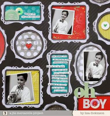
layout below by Lisa Dickinson on Pinterest and was in love! I already had the background paper, a
chalkboard print by My Mind's Eye so all I had to do was find coordinating patterns and accents to frame. Easy, peasy!
Exhibit 2:
Okay, for this one you may need to use your imagination a bit. My inspiration was actually a
digital page by designer "Lego" on Designer Digitals. On this particular page, I used only a part of the page for inspiration...namely, the large cut out title. I really liked the idea of cutting the letters out of the main piece and then backing them with other patterns. While creating this page, I had a tough time because I intended to use accents within each letter of the word "EAT" - buttons, brads, maybe even some washi tape. But after playing around with things for about 20 minutes, I ultimately decided it was too busy and just left the letters plain. In the end I do like how it turned out. I especially loved that I could include one of my most favorite quotes, "People who love to eat are always the best people." by Julia Child. So true, Julia. So true.
Exhibit 3:
One thing you'll notice about my pages is that I tend to be drawn to patterns and big, bold accents. I try my best to not overpower the pictures while still including my own dramatic flair with embellishments. In this example, my main "lift" is the title. I loved how Gillian Nelson kept her page,
"Hello", super clean and simple while incorporating a ginormous and powerful title. I also really appreciated the "freehand" aspect of the page - from the hand drawn outer border to the journaling, from the cursive title to the line accents, so I mimicked that as well.
Exhibit 4:
This is by far one of my most favorite scraplifts. Jennifer de Castro created the
original page, seen below, and it was chosen as layout of the week by Studio Calico several years back. I remember creating it quite vividly. It was about 2:30 am at a local scrapbook retreat and I sat, glossy-eyed punching and punching circles from various patterned scraps. After that, I sat mindlessly inking the edges of every single one until my fingertips and nails were brown and I looked like I just got done changing the oil in my car. I won't tell you that this one came together quickly (it did not!), but it was fairly easy. For your own sanity, it would be easier to use LARGER shapes because you need less of them. :-) After all is said and done, though, I adore how it came out! And, I was able to use up a bunch of my scraps!
Exhibit 5:
Now
this one is tricky! I actually used two different pages as inspiration in creating my own two-page spread. Amazingly, the pages are from two very different designers on two very different themes, but I was able to pull them together to create a cohesive layout. The left side is inspired by
GlueStickGirl's "Rock, Paper, Scissors" page while the right is inspired by Ali Edwards' (I
love her work!)
"Hello Pumpkins" page.
So, there you go - some examples of scraplifting. Don't feel bad about it - why not use the inspiration available to you in order to make creating your pages a little easier!? And if you want some more Pinspiration, be sure to check out our
Pinterest boards! You can also follow
me personally and my very own "Scraplifts" board by clicking
here. Thanks for visiting our blog and happy crafting!


No comments:
Post a Comment