Friday, September 28, 2018

Mini Stash-Buster!

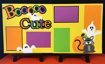
Our newest Kit of the Week just came out today and it's darling. I'm a sucker for puns, for bright colors, and for cute die cuts, so Boo Cute is right up my alley. I almost decided to keep this kit in its original form, but as I was digging through our stash, I found a few cute ways to make this one my own. But before we look at the changes, let's take a look at the original:
Boo Cute in original design

Look at those little ghosts and that cute little cat! I didn't want to take away from these great pieces, so I decided to look for ways that I could enhance them and make them a little original. In my stash, we've got a great assortment of ribbons, buttons, gems, and odds and ends, so I pulled a bunch out and just started playing with options. 


I love these ghosts, but they're pretty simple. I knew I wanted to punch these up. One of my favorite things to do is add little accessories to people or "living" things, so I looked for a way to add an item to the ghosts. A little bowtie was the perfect fit. I used some black gingham ribbon and created a bow for each one. It added a little continuity to the page by having this shared piece on each ghost and gave them a little more character.
By adding a little bowtie to the ghosts, the pages tie together a little better and the ghosts gain a little personality!

The die cut set at the bottom of the right page is adorable and detailed. Like the ghosts, I didn't want to take away from original cuteness, but just wanted to enhance it, so I played around with a little ribbon and buttons. I really wanted to create a vine on the pumpkin. I tried some jute and some solid green ribbon, but nothing seemed to flow well. When I spotted the brown gingham ribbon, I knew I had hit it on the nose. It is the perfect color for the pumpkin and it fits right in with the gingham ribbon on the ghosts. I started by gluing the end behind the pumpkin stem and then twisted and turned the ribbon while gluing down small pieces as I went. To top the pumpkin off, I found a large green button to place at the base of the stem. Super cute! I almost left the cat alone, but what's a cute little kitty without a collar tag? I found a bright purple button to round out this adorable little die cut set.


With just a little ribbon and a couple buttons, you can enhance the die cuts to make them your own.

The final simple change was to the title. Like I said, I love a good pun, so I was looking for a way to highlight it. I'm also a big fan of google eyes when they're used well, and I was determined to find a way to use them. I had a wide range of sizes and I spent a few minutes really trying to make the extra large google eyes work in the "O"s in Booooo. In the end, they just looked tacky, so I decided to scrap that. (Pun.😊) Instead, I decided to focus on the word "Cute". I realized the C and the E look a bit like they have an open mouth, so I incorporated the google eyes there. I turned the "C" into a cyclops with the large google eye, and I added a few free-hand cut teeth and medium google eyes to the "e" to make them look like a little monster. I absolutely LOVE the result! 


My little Cyclops "C" and Monster "e"

Let's take a look at the final result!

Boo Cute with embellishments

As you can see, with only a few little changes and just a couple random items from my stash, I was able to make some great little additions to this page kit! What do you think? I'd love to know what ideas you have - tell us in the comments! Happy Scrapping! ~Chalsea


Friday, September 21, 2018

Kit Expansion Project!

Kit expansions have become one of my new favorite things. I love taking a two-page layout and making it 3 (or sometimes 4!) with just a little bit of cardstock and creativity. This week's kit of the week, Fall Fun 2018, lent itself perfectly to this project!

Before we look at the changes, let's take a moment to admire the cuteness of this layout in its original form! 


Original Fall Fun 2018

The leafy swirls, those little crows in their basket! So darn cute. So why would I want to change it? Well, I just can't seem to stop taking photos and I can NEVER narrow them down enough for a two page layout. So it's either leave some cute ones off, do the same layout twice, or expand the layout. Expansion is - by far - my favorite option. Here's a quick look at my finished layout and I'll break down the changes page by page. 


The full 3-page expanded Fall Fun 2018 Layout

Just LOOK how many photos are on there! Nine 4 x 6 mats and one 4 x 4 mat for a total of TEN photos! And plenty of space for cute die cuts!

Now, there are a few things I think about when I'm adding a 3rd or 4th page. First, I need to make a background choice. Sometimes, it's most obvious to just match the color of the original, which is what I eventually decided on, but with this layout, there are so many color options! I played with the idea of making the middle background a much bolder fall color, but I decided to play with color in my mats and pattern paper. 

After I decide my background color, I then take a look at what came with the kit and start playing around with where the items might go. Sometimes, I keep cuts together - like I did the the leaf/acorn sprays - and sometimes, I decide there's enough going on in a section to spread it out - which I did with the basket of leaves. You can see the changes in these two photos:


The original layout has leaves inside and outside the basket with crows. The leaf/acorn sprays are set up here, too.
On my layout, I took the leaves from outside the basket and placed them on another page. The basket itself and the contents were enough and the cuteness factor stayed high enough to move them. With the leaf sprays, I kept the same idea, but changed up the color groups to fit with my photo mats.

When I've got my die cut options, I then move on to photo mats and additional paper. I'm a big fan of putting as many photos on a page as possible. I don't want it to look crowded, but the photos are what it's all about, so I leaned into the gorgeous colors in this layout and played around with some space. I like to experiment a little bit with photo mat placement, and - as much as I like symmetry and am conscious of flow - I LOVED the look of three completely different mat layout combinations. The colors popped, and each page had it's own - yet cohesive - feel.

Let's take a look at each page, now and I'll walk you through my thought process.

I knew I wanted to keep the title on this first page. Then all the actual Fall Fun would follow! 😉 This page looked a little empty, though, so I chose to pull both flourished onto the page to anchor the top and the bottom, and to fill this page with fun and bright photo mats. The yellow and red mats were included in the kit. It's always a favorite of mine to add pattern paper, if possible. It's just an extra, fun feature to make your layout pop. I happened to have a whole sheet of a great swirly, leafy, orange paper that mimicked the leafy swirl cutouts on this layout! I couldn't avoid using it. It was calling to me. So I used some of it to make a whole 4 x 6 photo mat to round out this page! I angled the photo mats to give them impression of them blowing through the breeze and placed the title pieces to avoid covering precious photo space.

Page 1
Page 2 flowed organically for me. I'm currently in love with this photo mat placement, so I chose a few rich colors and then used the "empty space" to feature some great die cuts. Like I mentioned before, I removed the "ground leaves" from the basket of crows and used them on the third page, but I left all of the rest of this die cut as is. I just can't get over their cuteness. I then placed the leaf/acorn sprays in the other sections. Now, when I use pattern paper, I like to find a way to use it throughout the layout, if possible, so I cut thin strips - 1/2 x 4 and 1/2 x 6 - and used them to embellish the photo mats. It just helps to tie the page kits together a little more, in my opinion.


Page 2
The final page, though simple, is so beautiful. Here, I tried another photo combination and worked a 4 x 4 mat into the mix. I knew I wanted to keep the tree far to the right on this layout - the branches were cut to run off the page, so they would not work in other locations, but I wanted to highlight it more than in the original. I love the fall colors, but I'm also enamored by the strong, stretching branches of the trees when they are bare. I think they are beautiful when they're resting, so I wanted to acknowledge this tree with her own page. I gathered the leaves from the ground of the crow basket and used them here, to spread out as they would have just fallen - little jewels falling to the ground. I also carried the pattern paper over to this page by using it as the ground. It's a subtle-enough pattern to not distract the eye, but it is interesting, too. This may be the simplest page, but it's the one that invokes the most feelings in me. Sometimes simple is just where it's at.


Page 3
Now that we've taken a look at all three pages individually, let's look at the whole 3-page layout once again. You can see how each page has it's own vibe, but they all work together to create one great Fall Fun layout. The pattern paper flows through each page, and the colors are evenly spread throughout the pages. I'm beyond thrilled with how this turned out!

The full 3-page expanded Fall Fun 2018 Layout
So what do you think? Do you think you'll try it? How would you do this differently? What little tricks do you have up your sleeve to expand kits or add more photos? We'd love to hear them! Happy Fall, and, as always, Happy Crafting!

Original Fall Fun 2018

Friday, September 14, 2018

Hidden Pocket Photos!


This summer, as a gift to my mother, we got extended family photos at a portrait studio. All together, there were 11 of us - quite a crew! We had an hour-long session, so you can imagine how many photos we had to choose from! Almost too many! When I saw the Kit of the Week for this week, I knew right away that it would be PERFECT for my family photos. The only problem? Not enough photo space! So what could I do? Well, I could always expand the pages, but I really wanted to keep them all together in a two-page layout. I just love the original set up. My solution? Hide some pull-out pocket photos right on the layout! I'm so thrilled with how it turned out. 

Completed So Much to be Thankful For Layout with photo pocket


So Much to be Thankful For layout with pocket photos removed.
Look how many photos I fit in there!
Photo pockets are one of my favorite tricks to fit more photos and I am so excited to show you how to do it! All you need is a little extra cardstock, some glue, and a scissors, and you can expand your photo options in just a few quick steps! 

I decided to use the fence to hide my pocket behind. It is pretty wide and tall enough to fit some good sized photos. If you try this with another layout, it could easily be hidden behind a photo mat or another large die cut. 

The first thing I did was assemble the fence. This would tell me how wide and tall I needed my dimensions. Once this was assembled, I started measuring my cardstock. I chose to use cardstock that matched the background in order to keep the pocket as hidden as possible. We are going to use an accordion fold to make this pocket, so it is important to leave enough margin on the sides and bottom of your die cut to allow folding. The top of the cardstock should be flush with the top of the die cut or photo mat. As you can see, I left about a 1" margin along the three sides of the die cut. Once I had it set, I glued down the fence so I could use it as a guide while folding.


Once I had my fence in place and solid, I flipped the cardstock over and started by folding the bottom flap up - matching the fold with the bottom of the fence. Once it was all lined up, I creased the fold and moved on to the next step.


Creating a bottom shelf for the photos to sit while in the pocket
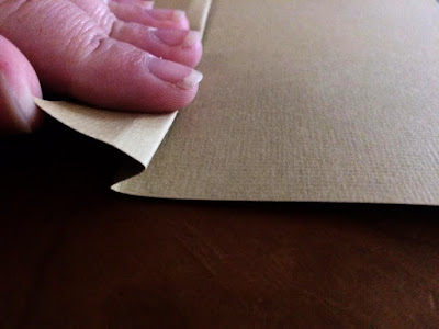
In order to create a space for the pocket photos to rest, we need to do a simple accordion fold to allow the pocket to pop out from the background cardstock. To do this, fold the cardstock back, as shown in the photo above. I didn't want it to stick out too far, so I aimed for a little less than 1/2" fold. Below is a scaled back photo of the accordion fold.

Back side of the bottom accordion fold
Front side of bottom accordion fold. 

Once the bottom fold is complete, we need to cut the corners to allow the sides to fold easily. The previous folds created fold lines that I used as a guide to cut my corners out.


Since I wanted the pocket to end at the side of the fence, I cut started my cut along the edge. This is where my side folds would line up.


Next, I used the fold crease as a guide to finish cutting out the corner.


Repeat these steps with the corner on the other side of the fence. Your cardstock should look like this on each side of the fence once the corners are removed.


When your corners have been removed, you can repeat the accordion folds with the cardstock on each side of the fence. When you've completed both sides, it should look similar to this on the back.


Here is a quick snap from the side. These flaps will be glued down to the background cardstock to create your pocket. Gluing the flaps down always gives me a little anxiety. 😊 It's so permanent! I like to compress the folds tightly first and then line up the bottom flap first. I line the top crease of the external fold to match where I want the bottom of the pocket to land. Once that flap is in place, I glue the side flaps while they are compressed. When they decompress, they'll force the pocket to pop forward, creating a space for your photos. Once the glue is set, I trimmed the edges down to match the edges of the background.


Once your pocket is completed, you'll need to create some pull tabs. I decided to use 3.75" x 3.5" photo mats, so I cut those out of cardstock. Then, I used the sunflowers to create the pull tabs. I cut strips of cardstock about 1" x 4" and glued them to the backs of the sunflowers.


Before I glued the tabs to the cardstock, I taped the tabs in various heights and set them in the pocket to make sure I got them right. Once I was satisfied, I glued them down. You can see by this photo that the heights are staggered.


Doesn't it look great? You can barely tell there's even a pocket! Let's take a look at what happens when you pull the sunflowers.

Here's tab #1 - N with his grandparents and great grandparents:


Tab #2 N with Dad and Mom:


Tab #3 - my parents/N's grandparents:


Tab #4 - my brother and sister-in-law:


All 5 Tabs together:


I'm over the moon about how this turned out. I got 10 photos on this 2 page layout, and, honestly, it could have been more! I chose to write names on the back of the pull-out photos, but I could have put photos on the backs of those, too, and fit a total of 15! THAT is something to get excited about!

Just some very simple journaling on the backs of the pull out photos

So what do you think? It's one of my favorite tricks because it's both simple and needs such little extra to make. But I'd love to know: Is this something you might try on your own? What are your thoughts? Share with us in the comments! 

Truly, So Much to be Thankful For


As I sign off, enjoy these precious photos of my family! :) Happy Crafting!


Thursday, September 13, 2018

Add a little DRAMA!

You've heard me say it many times - when we design a page kit, we've got a few different customers in mind. There's the brand new scrapbooker. She's excited to get going, but just doesn't quite know where to start or what her personal style will develop into. There's our busy bee. She may have been scrapbooking for a while, but, man, life is crazy. She just can't fit it in right now. For these two ladies, our page kits can be a huge help! Just pick out your theme, assemble it, and add your photos - TA DA! You can get a whole album done in one day! 

Original Drama Page Kit

Then there's my personal favorite - probably because I identify with her so much - she's crafty and creative, but she's practical and time/cost conscious. She loves scrapbooking, but either doesn't have the space/time/money to transform a whole room in her house, or doesn't have the desire to buy every new gadget when there might be a better way. She can take our page kit and use it as her starting point - the hard work has been done, she can have the fun! And this has become my favorite challenge - to take our kits and revamp them (sometimes in big ways and sometimes with subtlety) into a layout that is both personal and beautiful. And that's what I've done with this week's new BONUS kit!

I loved the look of this original Drama kit, but I wanted to add just a few little personal touches to really add the DRAMA! 😉 Look how cute it turned out!
Personalized Drama Kit

The best part about this revamp is that it used just a few items from my personal stash and it only took a couple minutes! Here's a quick breakdown of the additions:

Add some simple curtains with cardstock and ribbon!

To me, the stage isn't "The Stage" without the big, red curtains, so I knew I needed to find a way to add some in. I decided adding some curtains to the photo mats would be the perfect way! I used less than a 4x12 of crimson cardstock and I simply freehand cut one curtain and then used that one to trace the others! Then, I grabbed this great, sheer black ribbon, and tied it around each curtain side, finishing it with a bow. Isn't it perfect?

Jeweled spotlight and stars make this page kit pop!

When I think of the stage, sparkly, bright lights come to mind, so I knew I had to find a way to get some glam in there. Sparkly gems to the rescue! I have a big container of random sized clear gems, so I pulled that out and began experimenting. I chose large gems to put in the center of each star so I could spread out some of the sparkle throughout the page. Then, I decided these spotlights needed a little work. I made a little pile of random sized gems and started moving them around on the beam until I found an arrangement that looked right. I used the largest ones on the bottom and, as I moved up, I transitioned to smaller and smaller gems and spread them out a little more. I just love this jewel-encrusted spotlight!

With just these few extra additions and only a couple creative minutes, I had a page kit that pumped up the Drama and makes me super happy! What would you do to make this great kit your own?

Saturday, September 8, 2018

Kit Expansion Project!

One of my favorite things to do with our kits is stretch the layouts to multiple pages or projects. They're often so jam-packed with cardstock and die cuts that it's easy to do! Our newest Kit of the Week, Play the Day Away, was the perfect page kit to expand! I ended up getting 3 pages easily - and I probably could have gotten 4! We'll look at the simple changes, but here's the original kit:


Play the Day Away Layout

It's adorable, isn't it?!? I love the mix of playground equipment and the fact that it looks like an actual park! BUT, I've never been to the park with my kid and took only 4 photos. So I definitely needed to stretch this kit out to add more photo mats. With these great primary colors, adding cardstock was super-simple, and I love how it turned out. 
Expanded Play the Day Away Layout
The project was very simple. I matched the background and grass colors and added a full 12 x 12 of the light blue and a 4 x 12 of the green to create the center page. I loved the idea of the park, so I kept the background of the left and right pages the same - with the trees on the edges. My primary goal was to add more photos, so I rearranged the existing mats and added 3 more. I also wanted to pull in a little more color, so 1 added mat was red and the other two were a bright blue that I matched to the primary blue color in the title. After that, I rearranged the playground equipment and title until I loved the look and adhered! Isn't it cute! A few pieces of basic cardstock and it looks like it was made to be expanded! 
Here are a few closer shots of each page and our Facebook Video explaining the process.

New Left Page. I moved the title from this page to make more photo space, added a couple photo mats and rearranged the playground equipment.

Added Center Page. I added a 12 x 12 of light blue cardstock and a 4 x 12 of green for the grass. The title, photo mats, and playground equipment were moved from the outside pages to create this additional one!
New Right Side Page. Moving the large playground equipment made room for this additional photo mat!


 We love the new look of this expanded page kit! What do you think? Would you add another page and more photos? Change them around? How would you make this layout your own? Let us know in the comments! And don't forget to pick up Play the Day Away today. Happy Scrapping!