It's almost Valentine's Day and, as usual, it crept up faster than I thought. With my little dude in daycare and 4K and with lots of grandmas and grandpas, I've got a lot of Valentine cards to make. I decided whatever I did needed to be simple, so I grabbed my heart punches and some spare cardstock and just started playing around. I thought I'd share my creations here for anyone looking for last-minute inspiration!
I was able to make 6 different cards just mixing patterned paper and cardstock and using punched out hearts. Here's the group:
Here's what you need:
-Card bases. I used all white, but you can use any color.
-Coordinating colored paper in various patterns and sizes. I made sure I had some solid colored cardstock and some patterned paper. I also made sure some pieces were large enough to use as background pieces. Basically, just grab a variety from your stash. :)
-Heart paper punches. I used a variety of sizes so I had many options. I used 1/2", 1", 1 1/2" and 2".
-Adhesive
-Embellishments. I used gemstones, bakers twine and ribbon.
We'll take a closer look at each one and talk through my design process.
I decided to do some color blocking with this kit to make a simple design feature. The dark pink is 1/2" x 5 1/4". The white is 1/4" x 5 1/4". Light pink is 4" x 5 1/4". I then alternated hearts with white and pink backgrounds keeping the pattern colors compatible. I used the 1.5" punch to create these hearts. The gems were a final addition to add a little bit of glam.
I wanted to try a few different things with this card and I love how it turned out. I cut the pink cardstock to 4" x 5.25" and then placed the pattern piece (2"x 4") over it. The gathered hearts are 2", 1.5", 1", and .5" and the hearts along the side are all 1". I placed a large gemstone in the center of each of the these and ran some light pink gingham ribbon behind the group of hearts.
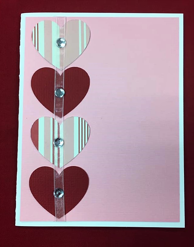
This card is very simple, but, to me, simple is good. I simply alternated 2" hearts in patterned paper and cardstock and then ran a sheer pink ribbon through the center of them. The medium gemstones anchor the ribbon and give the card a little excitement. You could leave this card as is or easily place a stamp on the right side.
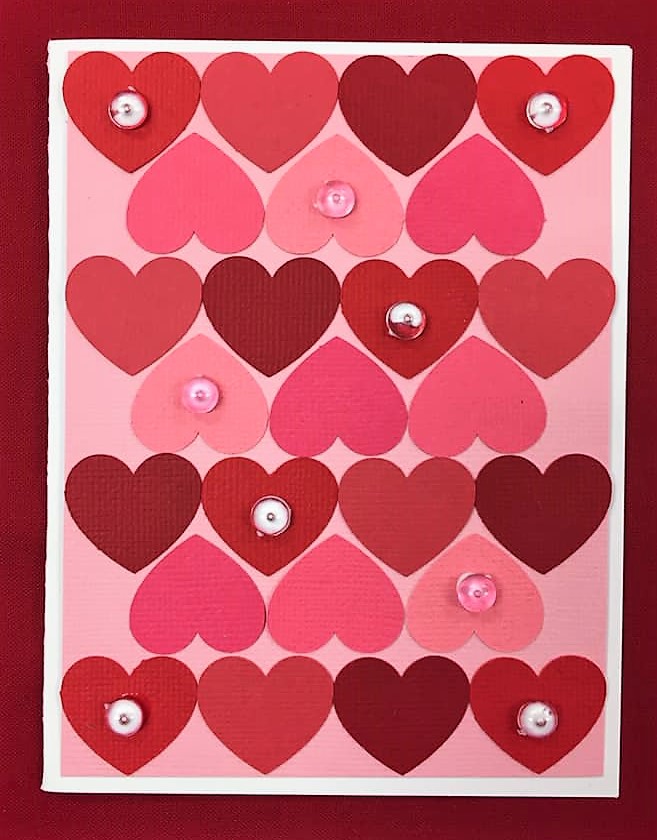
This card is also very simple, but the effect is fantastic! I used all 1" hearts in various reds and pinks. I then alternated red lines and pink lines creating this puzzle pattern. Pink and clear dew drops add a little dimension to the card.
How can we do a set of Valentine cards without doing some heart balloons? I chose coordinating colors and patterns to punch 2" hearts and then gathered them together in a bunch. I used solid red bakers twine for the strings and tied them off with a light pink gingham ribbon. The background cardstock is light pink with small white dots. It's subtle enough to add to the card, but not to pull focus from the balloons.
There's a surprise in this card! I used some of the 2" hearts to create a waterfall surprise message inside.
I used a similar method to creating a waterfall photo album to create this pull-out message. You can find my previous tutorial here.
This is definitely my favorite card of the bunch. I like non-traditional colors and it's 3D! I lightly pattern mixed here, which I also love. I chose the large yellow and white stripes as the background because it gave it a bright pop of color witout being too busy. This white and multicolor striped paper is SO pretty in person. The colors are soft and are beautiful. It was perfect for some heart balloons. So how did I make these beauties? Simple. You take four 2" hearts for each balloon. Each heart should be folded in half, with the side you want facing out on the inside of the fold. Then, you'll glue the backsides of the hearts together to create a bit of an accordion. Once the hearts are all glued together, you should have a simple 3D balloon heart. I then used solid purple bakers twine for the strings and gathered them with sheer pink ribbon.
I hope these have given you some inspiration for your Valentines crafts and cards! I'd love to know which card is your favorite! Let me know in the comments! Happy Scrapping!
Showing posts with label StashBusters. Show all posts
Wednesday, February 6, 2019
Heart Punch Valentine Cards
Labels:
Cards,
Inspiration,
Projects by Us,
StashBusters
Thursday, January 31, 2019
13 Ways to Personalize your Page Kit. #13: Patterned Paper
We've come to the final installment of 13 Ways to Personalize your Page Kit! We've covered so much ground! We've looked at adding embellishments, inking die cuts, using pop up dots to add dimension, expanding the kit to add more pages, sewing, adding personal touches with journaling, adding additional photos with a pop out photo album, secret flip-up journaling or photo space, swapping out colors with our Color Bundles, adding photo or journaling space with a simple waterfall album, using washi tape, and creating a pocket behind photo mats to hold additional keepsakes. You can check those out by clicking on the one you want to learn more about!
Our final personalization option is simple, but effective. With just a few inches of special paper, you can transform the simplicity of a kit to create something very special for yourself and your precious memories. I love our newest page kit - both its subject and its design, but I LOVE it even more with a few twists that I was able to make.
Personalization option #13: Patterned Paper
Using patterned paper is such a simple way to bring so much to your layouts. Don't get me wrong. Cardstock is awesome and we can do SO much with it but, sometimes, a punch of bright pattern paper, or the texture in the design, can highlight your design in the best ways. And this design is awesome. :) Let's take a look at Let's Bowl:
Bowling has a special place in my heart. There are so many memories related to bowling - family fun, birthday parties, high school dances, awkward dates, late night disco bowling. It's so much fun! I love that this page kit has a retro vibe that brings back all of the nostalgia.
The hardest part for me is choosing a pattern. Which is pretty much most of it, right? Haha! But it's a little bit of an art and a little bit of just trusting your gut. I often like to think about a couple things when I'm looking for a pattern.
1. What's the vibe I'm going for here? Is it subtle and gentle? Bright and cheerful? Antique? Modern? What do I want to feel when I look at it? For this layout, I wanted to feel fun, bright, and energetic.
2. What are the colors of the layout? Do I want them to match exactly? Do I want to find complementary colors? Are there any colors that are definitely off the table? This layout was especially tricky. The colors are fantastic - very bright and bold - but the greenish blue color mixed in with these bold reds, yellows, and oranges throws most color combinations off. I decided that I wanted to find colors that were bright and bold and could fit into that color wheel, but didn't necessarily have to match these. I also noted that the background was black - very stark - so I wanted the pattern paper to break up a little bit of the darkness.
3.What type of pattern am I going for? Do I want large prints or small features? Do I want randomness or geometrical or symmetrical? How much blank space am I looking for? I wasn't totally sure what I wanted here, but I knew it needed to be small enough of a pattern to peek out between the larger features of the layout. I am also generally drawn to geometrical and symmetrical patterns, so it was likely that I'd go that direction.
I just love how this layout turned out. It's so much fun to play with patterned paper and see how you can turn the volume up on an already fabulous layout to make it just a little more special. Those disco bowling photos will look FANTASTIC on this layout now! Don't you think?
And with that, we come to the end of our 13 Ways to Personalize your Page Kit series! It's been such a fun challenge to look at each of our new kits with fresh eyes and find ways to make them more special to me. If you've enjoyed it as much as I have, you're in luck! While I wont be revamping every kit we put out, I'll be choosing some each month to transform and blogging about it with tips and tricks. We'll be featuring new kits for sure, but also some of our wonderful classic kits as well! So let me know if there's one you'd love to see transformed or if there's a technique you'd like to see. I'm definitely up for the challenge! Until next time, Happy Scrapping!
Our final personalization option is simple, but effective. With just a few inches of special paper, you can transform the simplicity of a kit to create something very special for yourself and your precious memories. I love our newest page kit - both its subject and its design, but I LOVE it even more with a few twists that I was able to make.
Personalization option #13: Patterned Paper
Using patterned paper is such a simple way to bring so much to your layouts. Don't get me wrong. Cardstock is awesome and we can do SO much with it but, sometimes, a punch of bright pattern paper, or the texture in the design, can highlight your design in the best ways. And this design is awesome. :) Let's take a look at Let's Bowl:
![]() |
| Original Let's Bowl Layout |
The hardest part for me is choosing a pattern. Which is pretty much most of it, right? Haha! But it's a little bit of an art and a little bit of just trusting your gut. I often like to think about a couple things when I'm looking for a pattern.
1. What's the vibe I'm going for here? Is it subtle and gentle? Bright and cheerful? Antique? Modern? What do I want to feel when I look at it? For this layout, I wanted to feel fun, bright, and energetic.
2. What are the colors of the layout? Do I want them to match exactly? Do I want to find complementary colors? Are there any colors that are definitely off the table? This layout was especially tricky. The colors are fantastic - very bright and bold - but the greenish blue color mixed in with these bold reds, yellows, and oranges throws most color combinations off. I decided that I wanted to find colors that were bright and bold and could fit into that color wheel, but didn't necessarily have to match these. I also noted that the background was black - very stark - so I wanted the pattern paper to break up a little bit of the darkness.
3.What type of pattern am I going for? Do I want large prints or small features? Do I want randomness or geometrical or symmetrical? How much blank space am I looking for? I wasn't totally sure what I wanted here, but I knew it needed to be small enough of a pattern to peek out between the larger features of the layout. I am also generally drawn to geometrical and symmetrical patterns, so it was likely that I'd go that direction.
With those things in mind, I started my hunt, quickly eliminating many options just based on these few answers to the questions. I ended up with what I think is the PERFECT patterned paper for what I was going for. Check it out.
![]() |
| Bright, Bold, Energetic, Fun, and right in the wheelhouse for color! |
![]() |
| Here's a little close-up of the paper. |
I seriously love it so much. It's got a little bit of a retro feel and it has all of the characteristics I was looking for. The colors are really close, though not exact, and the bright white stands in stark contrast to the black. When tucked behind some of the larger pieces, it'll be a fantastic addition to the layout!
The next decision is to decide where to put the patterned paper. I usually play around with it for a little while, but I have a few rules I generally go by. They're strictly personal preferences - there are no real rules - but I usually love the outcome when I follow these.
1. If I'm placing patterned paper on one page of the layout, I usually want to work it into the other page or pages as well. It balances it out and makes it look more cohesive.
2. If I'm going to be placing it behind something, it needs to breathe. By that, I mean that I want to be able to see the original paper enough that I get the pattern, the feel, the colors. Otherwise, what's the point? Sometimes that can be achieved with a small strip of paper. Sometimes it needs a larger chunk.
You can see how I achieved those goals in my placement in these photos.
![]() |
| I decided to show more of the patterned paper by layering the photo mats and letting the patterned paper shine on top. |
![]() |
| Here's the full left side. I. am. in. LOVE. |
I just love how this layout turned out. It's so much fun to play with patterned paper and see how you can turn the volume up on an already fabulous layout to make it just a little more special. Those disco bowling photos will look FANTASTIC on this layout now! Don't you think?
![]() |
| Let's Bowl with Patterned Paper additions. |
And with that, we come to the end of our 13 Ways to Personalize your Page Kit series! It's been such a fun challenge to look at each of our new kits with fresh eyes and find ways to make them more special to me. If you've enjoyed it as much as I have, you're in luck! While I wont be revamping every kit we put out, I'll be choosing some each month to transform and blogging about it with tips and tricks. We'll be featuring new kits for sure, but also some of our wonderful classic kits as well! So let me know if there's one you'd love to see transformed or if there's a technique you'd like to see. I'm definitely up for the challenge! Until next time, Happy Scrapping!
Friday, September 28, 2018
Mini Stash-Buster!
Our newest Kit of the Week just came out today and it's darling. I'm a sucker for puns, for bright colors, and for cute die cuts, so Boo Cute is right up my alley. I almost decided to keep this kit in its original form, but as I was digging through our stash, I found a few cute ways to make this one my own. But before we look at the changes, let's take a look at the original:
Look at those little ghosts and that cute little cat! I didn't want to take away from these great pieces, so I decided to look for ways that I could enhance them and make them a little original. In my stash, we've got a great assortment of ribbons, buttons, gems, and odds and ends, so I pulled a bunch out and just started playing with options.
The die cut set at the bottom of the right page is adorable and detailed. Like the ghosts, I didn't want to take away from original cuteness, but just wanted to enhance it, so I played around with a little ribbon and buttons. I really wanted to create a vine on the pumpkin. I tried some jute and some solid green ribbon, but nothing seemed to flow well. When I spotted the brown gingham ribbon, I knew I had hit it on the nose. It is the perfect color for the pumpkin and it fits right in with the gingham ribbon on the ghosts. I started by gluing the end behind the pumpkin stem and then twisted and turned the ribbon while gluing down small pieces as I went. To top the pumpkin off, I found a large green button to place at the base of the stem. Super cute! I almost left the cat alone, but what's a cute little kitty without a collar tag? I found a bright purple button to round out this adorable little die cut set.
The final simple change was to the title. Like I said, I love a good pun, so I was looking for a way to highlight it. I'm also a big fan of google eyes when they're used well, and I was determined to find a way to use them. I had a wide range of sizes and I spent a few minutes really trying to make the extra large google eyes work in the "O"s in Booooo. In the end, they just looked tacky, so I decided to scrap that. (Pun.😊) Instead, I decided to focus on the word "Cute". I realized the C and the E look a bit like they have an open mouth, so I incorporated the google eyes there. I turned the "C" into a cyclops with the large google eye, and I added a few free-hand cut teeth and medium google eyes to the "e" to make them look like a little monster. I absolutely LOVE the result!
Let's take a look at the final result!
As you can see, with only a few little changes and just a couple random items from my stash, I was able to make some great little additions to this page kit! What do you think? I'd love to know what ideas you have - tell us in the comments! Happy Scrapping! ~Chalsea
![]() |
| Boo Cute in original design |
Look at those little ghosts and that cute little cat! I didn't want to take away from these great pieces, so I decided to look for ways that I could enhance them and make them a little original. In my stash, we've got a great assortment of ribbons, buttons, gems, and odds and ends, so I pulled a bunch out and just started playing with options.
I love these ghosts, but they're pretty simple. I knew I wanted to punch these up. One of my favorite things to do is add little accessories to people or "living" things, so I looked for a way to add an item to the ghosts. A little bowtie was the perfect fit. I used some black gingham ribbon and created a bow for each one. It added a little continuity to the page by having this shared piece on each ghost and gave them a little more character.
![]() |
| By adding a little bowtie to the ghosts, the pages tie together a little better and the ghosts gain a little personality! |
The die cut set at the bottom of the right page is adorable and detailed. Like the ghosts, I didn't want to take away from original cuteness, but just wanted to enhance it, so I played around with a little ribbon and buttons. I really wanted to create a vine on the pumpkin. I tried some jute and some solid green ribbon, but nothing seemed to flow well. When I spotted the brown gingham ribbon, I knew I had hit it on the nose. It is the perfect color for the pumpkin and it fits right in with the gingham ribbon on the ghosts. I started by gluing the end behind the pumpkin stem and then twisted and turned the ribbon while gluing down small pieces as I went. To top the pumpkin off, I found a large green button to place at the base of the stem. Super cute! I almost left the cat alone, but what's a cute little kitty without a collar tag? I found a bright purple button to round out this adorable little die cut set.
![]() |
| With just a little ribbon and a couple buttons, you can enhance the die cuts to make them your own. |
The final simple change was to the title. Like I said, I love a good pun, so I was looking for a way to highlight it. I'm also a big fan of google eyes when they're used well, and I was determined to find a way to use them. I had a wide range of sizes and I spent a few minutes really trying to make the extra large google eyes work in the "O"s in Booooo. In the end, they just looked tacky, so I decided to scrap that. (Pun.😊) Instead, I decided to focus on the word "Cute". I realized the C and the E look a bit like they have an open mouth, so I incorporated the google eyes there. I turned the "C" into a cyclops with the large google eye, and I added a few free-hand cut teeth and medium google eyes to the "e" to make them look like a little monster. I absolutely LOVE the result!
![]() |
| My little Cyclops "C" and Monster "e" |
Let's take a look at the final result!
![]() |
| Boo Cute with embellishments |
As you can see, with only a few little changes and just a couple random items from my stash, I was able to make some great little additions to this page kit! What do you think? I'd love to know what ideas you have - tell us in the comments! Happy Scrapping! ~Chalsea
Labels:
Our PageKits,
Pagekit Revamp,
Projects by Us,
StashBusters
Subscribe to:
Posts (Atom)


