Showing posts with label Inspiration. Show all posts

Thursday, March 14, 2019

$5 Color Packs!

We've got some exciting news! We've had so many requests for cardstock that we have decided to offer new Color Packs for purchase on our website! So what is a Color Pack? Great question. 😉 Our Color Packs are packs of cardstock that are multiple shades (SIX to be exact) of the color you choose. For example, our Red pack has 6 different shades of red for you to use on your projects! Each color pack includes two full 12 x 12 sheets of each of the 6 colors, giving you 12 full sheets of cardstock for just $5!! Pretty fantastic! And with 10 different Color Pack color options, we've definitely got you covered for all of your crafty needs.

Aqua Color Pack

Blue Color Pack

Candy Pink Color Pack

Green Color Pack

Neutral Color Pack

Orange Color Pack

Party Pink Color Pack

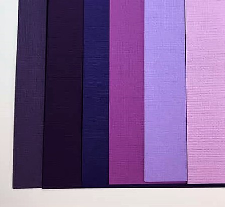
Purple Color Pack

Red Color Pack

Yellow Color Pack


This week, we debuted them on our Facebook page and website, and they're flying off the shelves! Chalsea also took our Candy Pink Color Pack and made a video tutorial to show simple ways to use the pack to transform our page kits. Check out the amazing transformation!


The possibilities are really endless and, for $5, how can you go wrong?! So pick yours up today while they're in stock!

Wednesday, February 6, 2019

Heart Punch Valentine Cards

It's almost Valentine's Day and, as usual, it crept up faster than I thought. With my little dude in daycare and 4K and with lots of grandmas and grandpas, I've got a lot of Valentine cards to make. I decided whatever I did needed to be simple, so I grabbed my heart punches and some spare cardstock and just started playing around. I thought I'd share my creations here for anyone looking for last-minute inspiration!

I was able to make 6 different cards just mixing patterned paper and cardstock and using punched out hearts. Here's the group:


Here's what you need: 
-Card bases. I used all white, but you can use any color.
-Coordinating colored paper in various patterns and sizes. I made sure I had some solid colored cardstock and some patterned paper. I also made sure some pieces were large enough to use as background pieces. Basically, just grab a variety from your stash. :)
-Heart paper punches. I used a variety of sizes so I had many options. I used 1/2", 1", 1 1/2" and 2".
-Adhesive
-Embellishments. I used gemstones, bakers twine and ribbon.

We'll take a closer look at each one and talk through my design process.


I decided to do some color blocking with this kit to make a simple design feature. The dark pink is 1/2" x 5 1/4". The white is 1/4" x 5 1/4". Light pink is 4" x 5 1/4". I then alternated hearts with white and pink backgrounds keeping the pattern colors compatible. I used the 1.5" punch to create these hearts. The gems were a final addition to add a little bit of glam.


I wanted to try a few different things with this card and I love how it turned out. I cut the pink cardstock to 4" x 5.25" and then placed the pattern piece (2"x 4") over it. The gathered hearts are 2", 1.5", 1", and .5" and the hearts along the side are all 1". I placed a large gemstone in the center of each of the these and ran some light pink gingham ribbon behind the group of hearts.


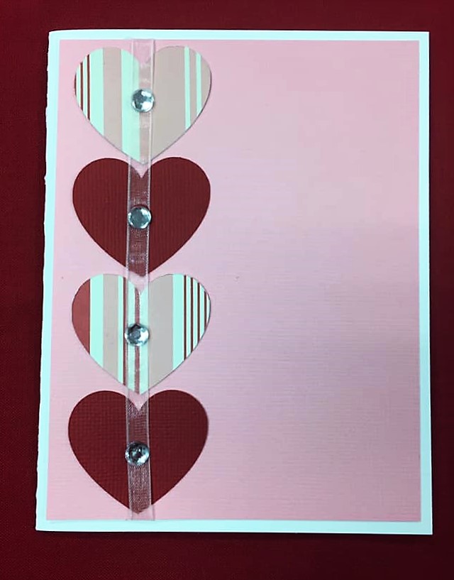
This card is very simple, but, to me, simple is good. I simply alternated 2" hearts in patterned paper and cardstock and then ran a sheer pink ribbon through the center of them. The medium gemstones anchor the ribbon and give the card a little excitement. You could leave this card as is or easily place a stamp on the right side.


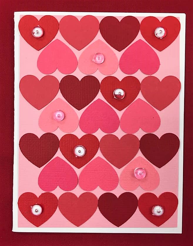
This card is also very simple, but the effect is fantastic! I used all 1" hearts in various reds and pinks. I then alternated red lines and pink lines creating this puzzle pattern. Pink and clear dew drops add a little dimension to the card.


How can we do a set of Valentine cards without doing some heart balloons? I chose coordinating colors and patterns to punch 2" hearts and then gathered them together in a bunch. I used solid red bakers twine for the strings and tied them off with a light pink gingham ribbon. The background cardstock is light pink with small white dots. It's subtle enough to add to the card, but not to pull focus from the balloons.

There's a surprise in this card! I used some of the 2" hearts to create a waterfall surprise message inside.


I used a similar method to creating a waterfall photo album to create this pull-out message. You can find my previous tutorial here. 


This is definitely my favorite card of the bunch. I like non-traditional colors and it's 3D! I lightly pattern mixed here, which I also love. I chose the large yellow and white stripes as the background because it gave it a bright pop of color witout being too busy. This white and multicolor striped paper is SO pretty in person. The colors are soft and are beautiful. It was perfect for some heart balloons. So how did I make these beauties? Simple. You take four 2" hearts for each balloon. Each heart should be folded in half, with the side you want facing out on the inside of the fold. Then, you'll glue the backsides of the hearts together to create a bit of an accordion. Once the hearts are all glued together, you should have a simple 3D balloon heart. I then used solid purple bakers twine for the strings and gathered them with sheer pink ribbon.

I hope these have given you some inspiration for your Valentines crafts and cards! I'd love to know which card is your favorite! Let me know in the comments! Happy Scrapping!

Thursday, January 31, 2019

13 Ways to Personalize your Page Kit. #13: Patterned Paper

We've come to the final installment of 13 Ways to Personalize your Page Kit! We've covered so much ground! We've looked at adding embellishments, inking die cuts, using pop up dots to add dimension, expanding the kit to add more pages, sewing, adding personal touches with journaling, adding additional photos with a pop out photo album, secret flip-up journaling or photo space, swapping out colors with our Color Bundles, adding photo or journaling space with a simple waterfall album, using washi tape, and creating a pocket behind photo mats to hold additional keepsakes. You can check those out by clicking on the one you want to learn more about! 

Our final personalization option is simple, but effective. With just a few inches of special paper, you can transform the simplicity of a kit to create something very special for yourself and your precious memories. I love our newest page kit - both its subject and its design, but I LOVE it even more with a few twists that I was able to make.

Personalization option #13: Patterned Paper

Using patterned paper is such a simple way to bring so much to your layouts. Don't get me wrong. Cardstock is awesome and we can do SO much with it but, sometimes, a punch of bright pattern paper, or the texture in the design, can highlight your design in the best ways. And this design is awesome. :) Let's take a look at Let's Bowl:


Original Let's Bowl Layout
Bowling has a special place in my heart. There are so many memories related to bowling - family fun, birthday parties, high school dances, awkward dates, late night disco bowling. It's so much fun! I love that this page kit has a retro vibe that brings back all of the nostalgia.

The hardest part for me is choosing a pattern. Which is pretty much most of it, right? Haha! But it's a little bit of an art and a little bit of just trusting your gut. I often like to think about a couple things when I'm looking for a pattern. 

1. What's the vibe I'm going for here? Is it subtle and gentle? Bright and cheerful? Antique? Modern? What do I want to feel when I look at it? For this layout, I wanted to feel fun, bright, and energetic.

2. What are the colors of the layout? Do I want them to match exactly? Do I want to find complementary colors? Are there any colors that are definitely off the table? This layout was especially tricky. The colors are fantastic - very bright and bold - but the greenish blue color mixed in with these bold reds, yellows, and oranges throws most color combinations off. I decided that I wanted to find colors that were bright and bold and could fit into that color wheel, but didn't necessarily have to match these. I also noted that the background was black - very stark - so I wanted the pattern paper to break up a little bit of the darkness.

3.What type of pattern am I going for? Do I want large prints or small features? Do I want randomness  or geometrical or symmetrical? How much blank space am I looking for? I wasn't totally sure what I wanted here, but I knew it needed to be small enough of a pattern to peek out between the larger features of the layout. I am also generally drawn to geometrical and symmetrical patterns, so it was likely that I'd go that direction.


With those things in mind, I started my hunt, quickly eliminating many options just based on these few answers to the questions. I ended up with what I think is the PERFECT patterned paper for what I was going for. Check it out.

Bright, Bold, Energetic, Fun, and right in the wheelhouse for color! 
Here's a little close-up of the paper.


I seriously love it so much. It's got a little bit of a retro feel and it has all of the characteristics I was looking for. The colors are really close, though not exact, and the bright white stands in stark contrast to the black. When tucked behind some of the larger pieces, it'll be a fantastic addition to the layout! 

The next decision is to decide where to put the patterned paper. I usually play around with it for a little while, but I have a few rules I generally go by. They're strictly personal preferences - there are no real rules - but I usually love the outcome when I follow these.

1. If I'm placing patterned paper on one page of the layout, I usually want to work it into the other page or pages as well. It balances it out and makes it look more cohesive.

2. If I'm going to be placing it behind something, it needs to breathe. By that, I mean that I want to be able to see the original paper enough that I get the pattern, the feel, the colors. Otherwise, what's the point? Sometimes that can be achieved with a small strip of paper. Sometimes it needs a larger chunk.

You can see how I achieved those goals in my placement in these photos.

The large strip at the top allowed me to break up some of the darkness of this page but not take it over. I made sure to place my photo mats in places where the bursts could be seen. Looking at this again, I may change the placement of the red star. I don't love how it's covering the patterned paper when there is plenty of blank space left on that side of the layout. I would probably move it.
I decided to show more of the patterned paper by layering the photo mats and letting the patterned paper shine on top.

With the bold patterned paper photo mat right next door, I decided to keep this one a little more subtle. I cut the top photo mat a little smaller than I normally would to show the bursts around the outsides.

Here's the full left side. I. am. in. LOVE.

I just love how this layout turned out. It's so much fun to play with patterned paper and see how you can turn the volume up on an already fabulous layout to make it just a little more special. Those disco bowling photos will look FANTASTIC on this layout now! Don't you think?


Let's Bowl with Patterned Paper additions.

And with that, we come to the end of our 13 Ways to Personalize your Page Kit series! It's been such a fun challenge to look at each of our new kits with fresh eyes and find ways to make them more special to me. If you've enjoyed it as much as I have, you're in luck! While I wont be revamping every kit we put out, I'll be choosing some each month to transform and blogging about it with tips and tricks. We'll be featuring new kits for sure, but also some of our wonderful classic kits as well! So let me know if there's one you'd love to see transformed or if there's a technique you'd like to see. I'm definitely up for the challenge! Until next time, Happy Scrapping!

Tuesday, January 29, 2019

13 Ways to Personalize your Page Kit. #12: Pockets!

It's time for installment #12 of 13 Ways to Personalize your Page Kit! If you've missed our previous posts, you can find them here (1, 2, 3, 4, 5, 6, 7, 8, 9, 10, 11). We're almost to our big number 13! Why 13? Down Memory Lane turns 13 this year and we're finding lots of ways to celebrate. Along with weekly and monthly deals throughout the month of January (check them out on our Facebook page!), we're releasing 13 brand new page kits and doing a blog series on 13 ways to personalize them - 1 post for each of the years we've been blessed to be a part of your memory keeping. 

Our 12th option is one that I commonly use because it's so quick and easy. I also love it because I usually have extras that I want to keep - extra photos, notes, tickets, brochures, etc - but I don't want to put them on the main layout. Creating a simple pocket makes a space for them without cutting out any of the layout's design! 

Personalization Option #12: Pockets!

Before we get to the changes, let's look at the page kit we're highlighting today:
Original Swim Layout
As is often the case for me with sports layouts, I always have more than photos that I want to keep. I probably border on ridiculous, but I keep programs, schedules, stats, newspaper clippings, and various other momentos from the season. I used to struggle with what to do with all of those, but creating pockets has worked wonders for me!

I almost feel a little weird doing an entire blog post on this because it's so simple to do, but it really changes the game for me with scrapbooking. The best part is that all you need is a page kit and some adhesive. 

What I usually do is take a look a the layout and assess where I can create pockets. Sometimes, if there is a large die cut, I can put a pocket behind it, but most of the time, I just use the photo mats. The photos will be placed on the top, and then the momentos can be placed - hidden - behind the photo mat in the pocket. 

Once you've chosen your photo mat, you'll just need to put adhesive on three sides (leaving the top open). I try to put the glue as close to the edges as possible to leave the most pocket space.


When you've got your adhesive on the mat, you just place that mat where you would have placed your photo mat and voila! You've got a pocket! Now you've got somewhere to place those special things you want to save but don't want to feature.

Swim page with pocket

The great part is that it doesn't change the layout and you'd never know it was there! 
Swim layout with pocket - keepsake inside

Swim layout with pocket - keepsake showing

As I said, it's ridiculously simple! But that doesn't mean it's not fabulous! We've got one more personalization option coming in the next few days as we round out the first month of this new year. Catch up on those previous posts and come back for installment #13!

Thursday, January 24, 2019

13 Ways to Personalize your Page Kit. #10: Waterfall Album

We're on number 10 of 13 Ways to Personalize your Page Kits and this method is one of my favorites for its aesthetic appeal and functionality. The Waterfall Album takes a little extra care to make sure the dimensions are right, but the effect is fantastic! And it's interactive, which always gets me excited. 

If you're just hopping into this blog series, we've done 9 page kit revamps using various techniques. You can check them out here: 1. Embellishments, 2. Inking, 3. Pop-Up Dots, 4. Expansion, 5. Sewing, 6. Journaling, 7. Pop-Up Photos, 8. Secret Flip-Up Space, and 9. Color Changes. Some of those techniques have drastically changed the page kit and some have just given them a little punch and personality. Check them out!

For this method, we're using our newest travel kit, And We're Off, and I couldn't think of a better one to add additional photo mats to! After all, we all take way too many photos when we're travelling! And I never want to cut them down. This one has a little bonus - there are 3 versions! We don't all travel the same way, so we've got the plane, the car, and the ship. The waterfall album is the same no matter which one you use, but I've got to show you all of them in their original form - they're just too cute!

And We're Off - Plane
And We're Off - Car

And We're Off - Ship
Aren't they the best!? I love the vibe. On the original layout, there are 6 photo mats, which is pretty great, but like I said, 6 is just never enough for me. A really simple way to add more photos without adding another entire page is to add a waterfall album. They're interactive, they look great, and they do the job well!

Below, you can see the finished product as it flips through.


Let's see how it's done.

Personalization Option #10: Waterfall Album

First, gather your products. You'll need a ruler, a pencil, glue, and your cardstock. I wanted to have 5 photos, so I had (5) 4" x 4" brown squares, (5) 3 3/4" x 3 3/4" cream squares to double mat, and (1) 1 1/2" x 12" strip of squash cardstock. If you don't want to double mat your photos, you do not need the 3 3/4" squares.

Everything you'll need to create the waterfall album
Once you have your supplies, we'll focus on getting the cardstock lined up. You'll need to take one of your 4" x 4" squares and your 1 1/2" x 12" strip and line the square up with the short end of the strip, like below.

Line up the first square with the bottom of the strip
 Mark a line at the top of that square. You'll use this line to measure from in our next step.

 Remove the square and set to the side for now.


Next, you'll use your ruler and pencil to mark out the lines for the rest of the squares. Mark one mark for each photo square 1 mm apart from the original line. I had 4 additional squares (after the original square), so I marked the edge 1 mm apart for each one - 4 additional marks in total.

Use your ruler to mark one 1 mm mark for every additional photo square 
Next, mark 1 mm for each photo on the other side of the strip. Then you'll connect those lines using the ruler and your pencil.


At this point, you can set aside your ruler and pencil. Fold the strip along each penciled line. You will fold away from you. If you have 5 lines, you should have 5 folds bending backwards.

First fold. Fold along each line bending it away from you.

Second fold. Just keep going until they're all bent.

The strip should look like this at the end. Again, you'll have as many folds as you have photo mats.
Next we'll add our photo mats to the strip. If you have not already, now would be the time to adhere your mats together if you're double matting them.

Photo mats all ready to go!
Place your adhesive on the bottom of the strip - stopping before the first folded line. Then take your first photo mat and place it on the strip. It should fit perfectly, since the line was drawn to size. Make sure the strip is placed down the center. 

Do not put adhesive above the first line


Line up the photo mat with the bottom of the strip and the line at the top and press down.
As best you can, line the strip up in the center of the photo mat. I eyeballed this. You can measure if you want to.
After your first mat is adhered, we'll move on to the next. For each additional mat, you'll put adhesive on the strip between the folded lines. Then line the top of the mat with the line and line the sides with the mat below. Repeat this until you've adhered all of the additional mats.

Adhesive placed for the second mat

Second mat adhered 
Adhesive for 3rd mat

All photo mats adhered

All photo mats adhered - back view

After all mats are adhered, take the remaining strip sticking out the top and bend back, creasing at the top of the highest mat, and folding flat to the back of the mats.

Folding the strip back behind

Strip flattened to back
And you're done! This is how it should look when completed.

Completed Waterfall Album
 That tab that sticks out the bottom is your pull tab! You just pull gently on the tab and your photos will begin to flip up. It's like magic! 😉
Gently pull the tab and watch your photos go by!

Taa-Daa!

Pulled completely - bottom photo
Now, you can place your waterfall album on your layout and enjoy!

And We're Off with Waterfall album

And We're Off with Waterfall Album opening
Pro tips: when you adhere your waterfall, there's a couple things to keep in mind. First, make sure you place your adhesive on the bottom photo mat only. You don't want to place your adhesive on the pull tab - or it wont pull! And make sure to only put it on the bottom mat or the top ones will not flip up.
Also, the adhesive you use makes a difference. Make sure you use heavy duty adhesive if you can. This will help the waterfall hold up over time - and over many pull tab pulls. We like Supertape by iCraft, pictured below. You can find it here: Supertape on Amazon, or pick it up from your local craft store. 


I hope you enjoyed this tutorial and that you'll give it a try! Stay tuned for our final 3 ways to personalize your page kits through the end of January!